Plotting the Evolution of Movies Durations (1916-2018)
Two weeks ago I created and put online a box plot of 73k movies durations across the time.
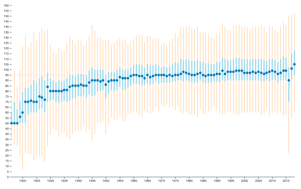
It started with a question: “Are movies getting longer and longer?”. Spoiler: Not really, except maybe in the last couple of years.
I used Wikidata’s online query service to export all movies then filtered those with both a publication date and a duration. This gave me a large JSON which I processed using Python in order to extract a couple numbers for each year: min, max, median, first and third quartiles.
The result fits in a small JSON file, which I then used to build a D3 using a few lines of JS. I used colorbrewer2 to find a colorblind-safe color palette.
You can see the result as well as the JS code on Observable.
To avoid outliers such as “Modern Times Forever” (240 hours) or
“The Burning of the Red Lotus Temple”, I used the interquartile
range (IQR) to limit the size of the bars: any movie whose duration is
below Q1-1.5×IQR or above Q3+1.5×IQR (where Q1 is the first quartile and
Q3 the third one) is not shown.
Results
As one can see on the graph, the median duration quickly rises from 50 to 95 minutes from the 1920s to the 1960s, then doesn’t move much except in the last two years.
Limitations
The first obvious limitation is the data: Wikidata has 200k+ movies but only 73k have both a publication date and a duration. It’s not complete enough to let me filter by movie type; e.g. feature film vs. others.
IMDb lists 5.3M titles (most of which are TV episodes), but there’s no way to export them all.
In the end, there’s no way to know how representative Wikidata’s movies dataset is. It does give a hint, but this graph is not a definitive answer to the original question.
See the Python code.